


For this freelance project, I created a branding vision for a client who intends on starting an independent bookkeeping practice. Their business will primarily focus on providing services to local small businesses in rural northern BC communities.
The branding for Blue Fern reflects a business that is modern, progressive, and community grounded. Designs are clean, visually pleasing, and simple, with a strong minimalist theme.
Blue Fern’s main branding goals: to communicate a service that is accessible, adaptable to changing financial needs, and reliable.
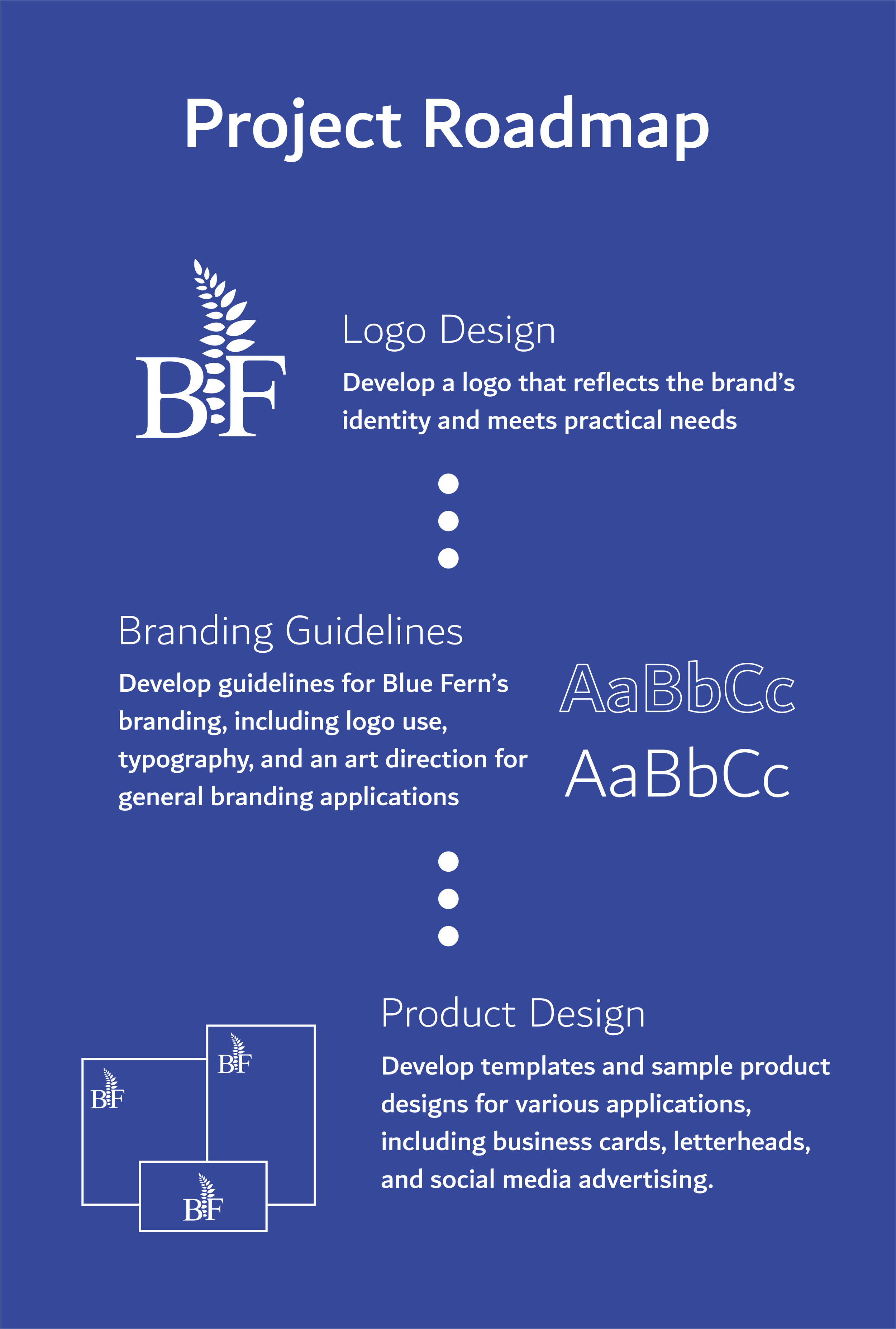


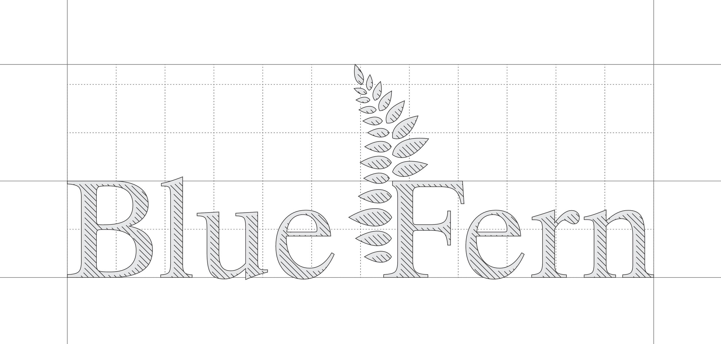


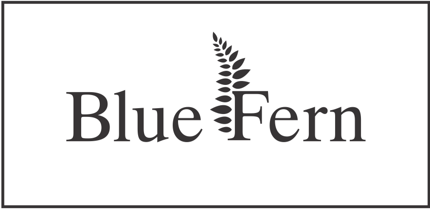
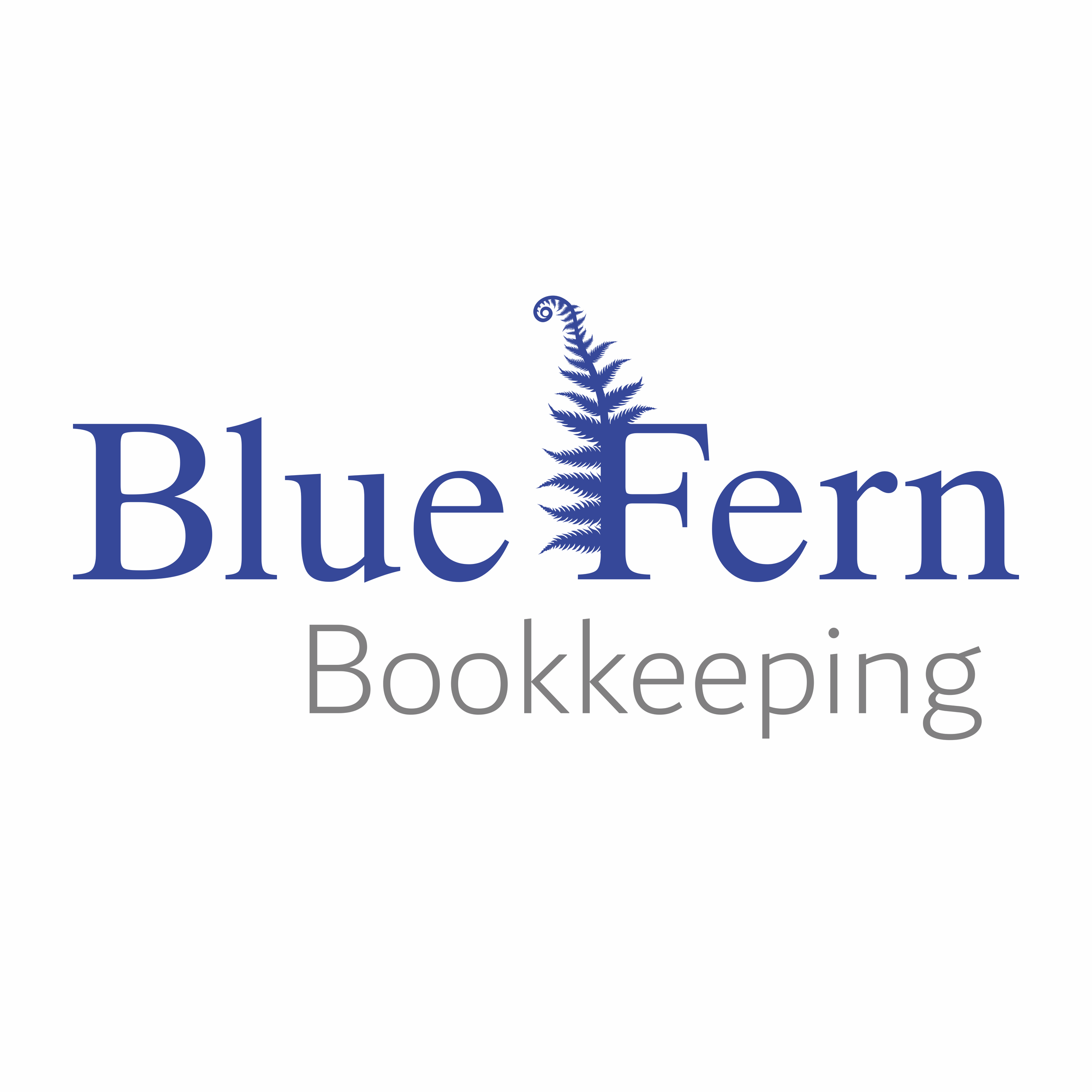
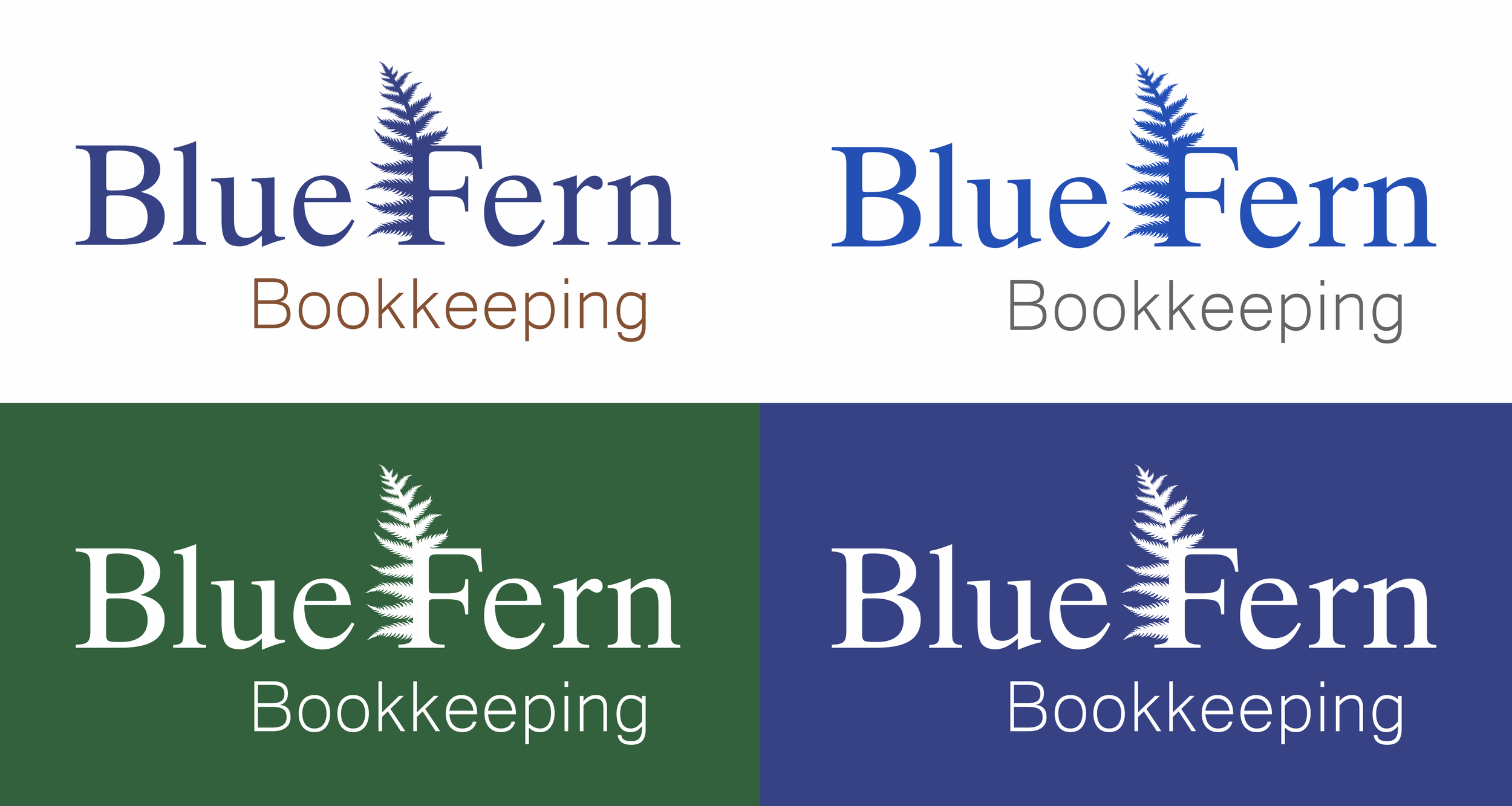
The Blue Fern logo features a modified Serif font with subtle curvature and character elements. It has personality that distinguishes it from 'blocky' text common in corporate logos, while still maintaining a clean and professional appearance. The fern is designed to retain it's overall visual form even on a smaller print space. Its clean, minimalist design helps tie everything together and give flow to the overall appearance of the logo.
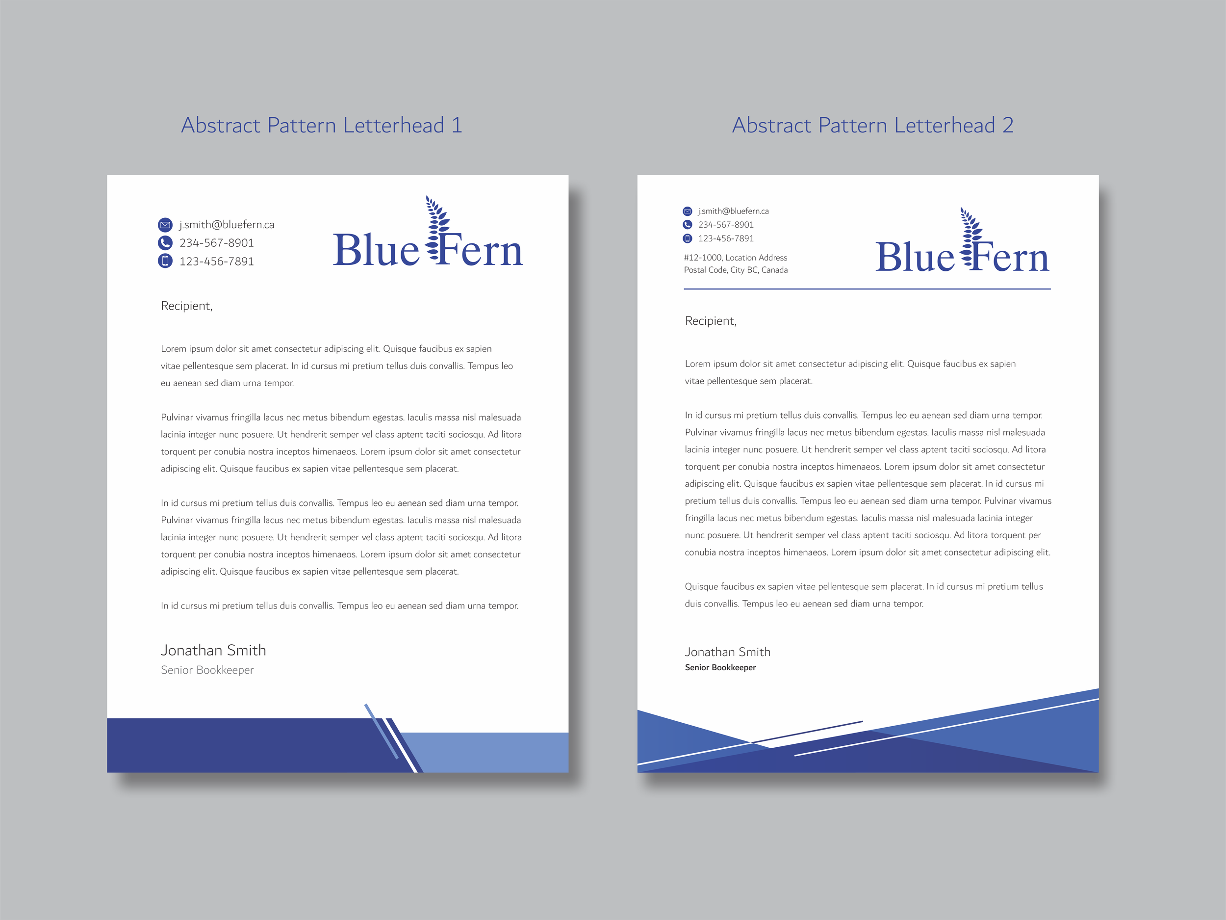
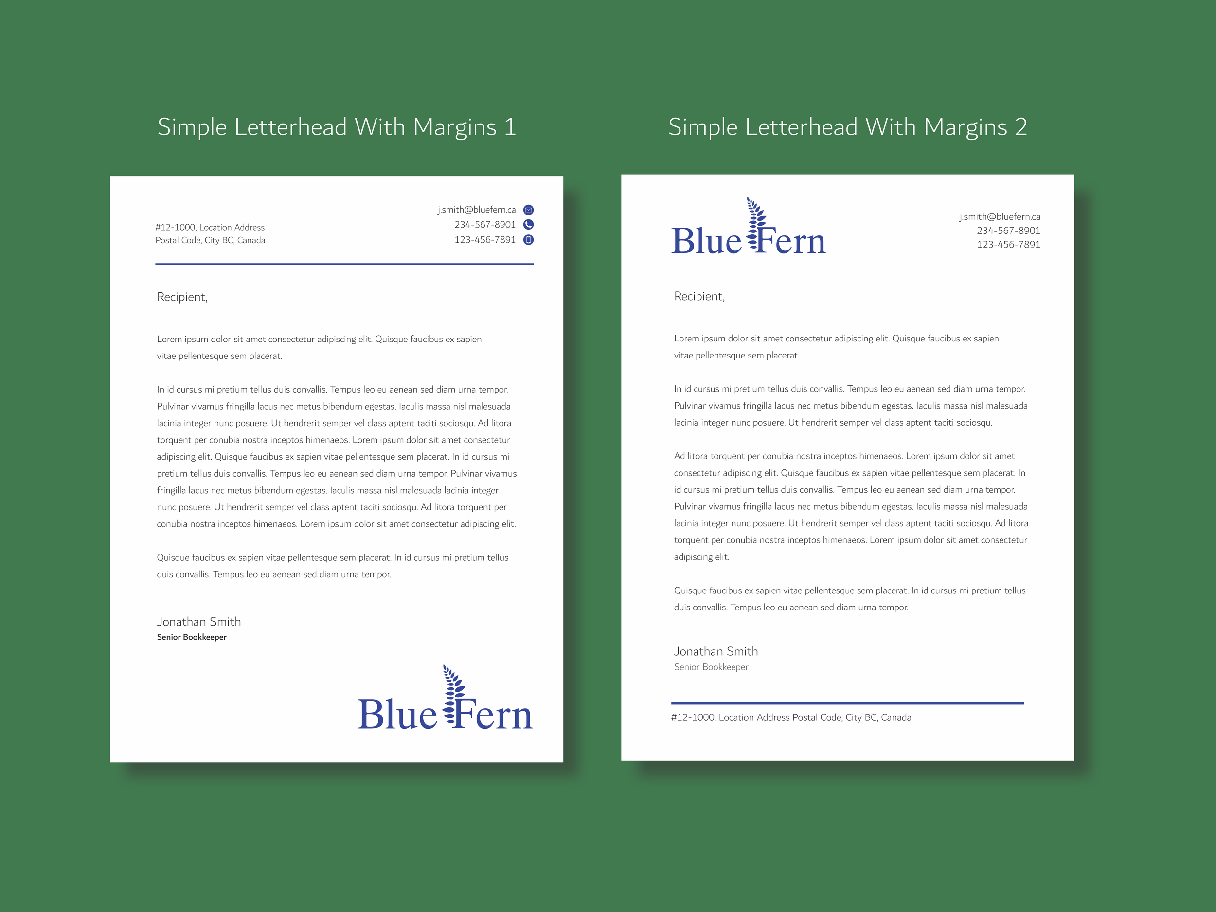
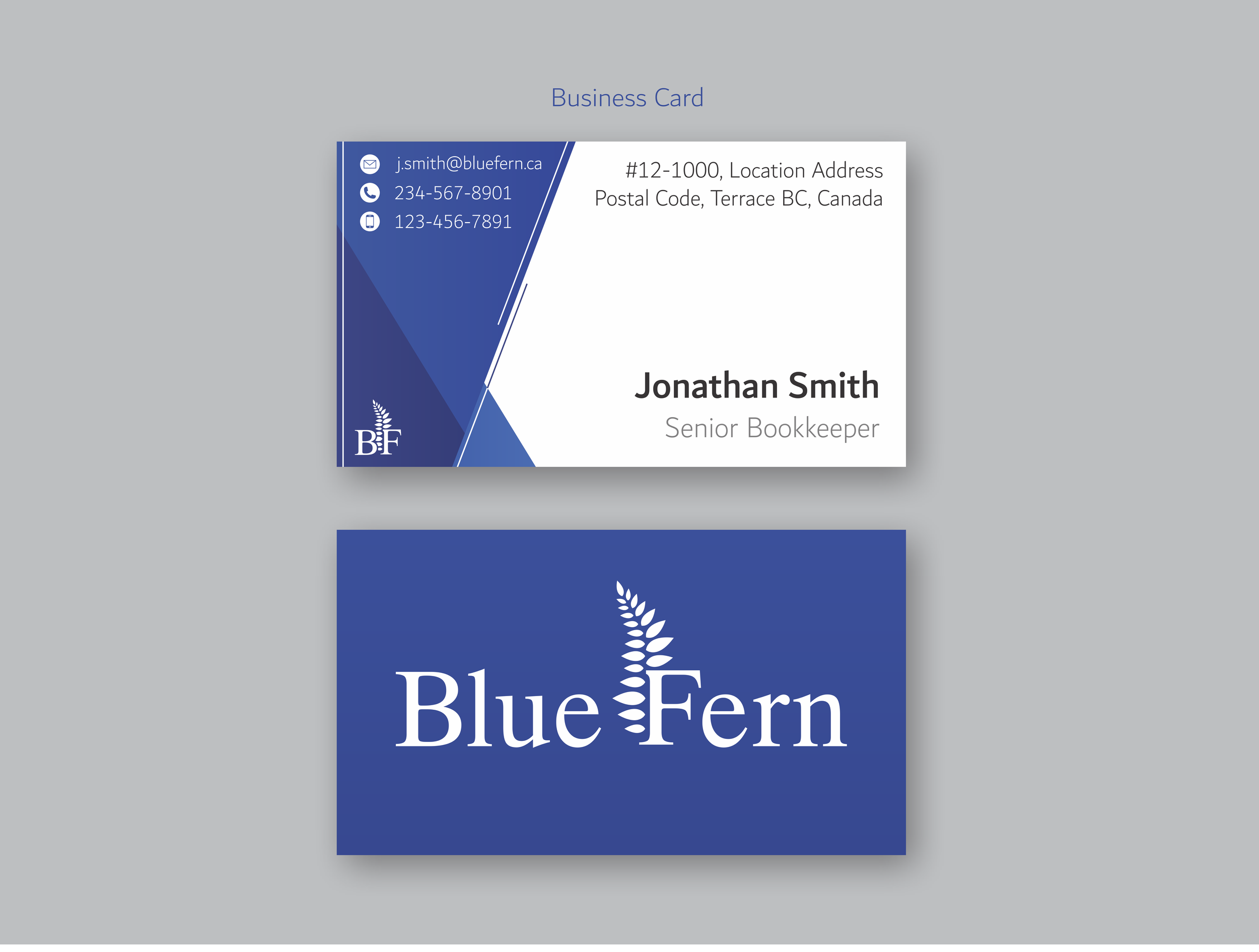
The Blue Fern logo is primarily designed with letterheads and business cards in mind, but is optimized for most digital and print applications.

Rules for general formatting and use are standard in branding guidelines, as they enforce consistency across all applications. This gives strength to the brand by reinforcing its recognizability. When developing formatting rules, one must consider a wide variety of potential applications for the logo. For example, the logo might be printed, painted, embroidered, or cut out of vinyl. Contractors or other users need to know that the logo should not be altered in certain ways or printed in a different color, and that the logo must have space around it so it does not appear cluttered on a brochure or social media advertisement.
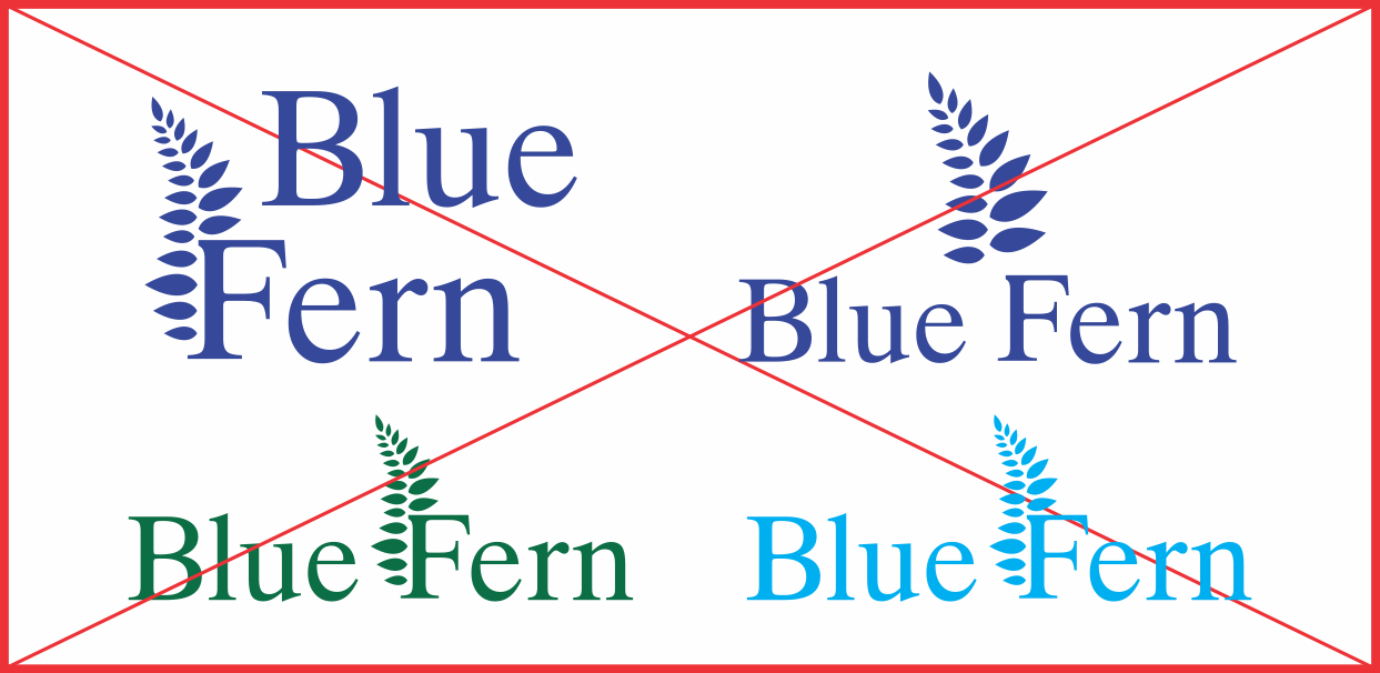
Logo should not be altered or recolored
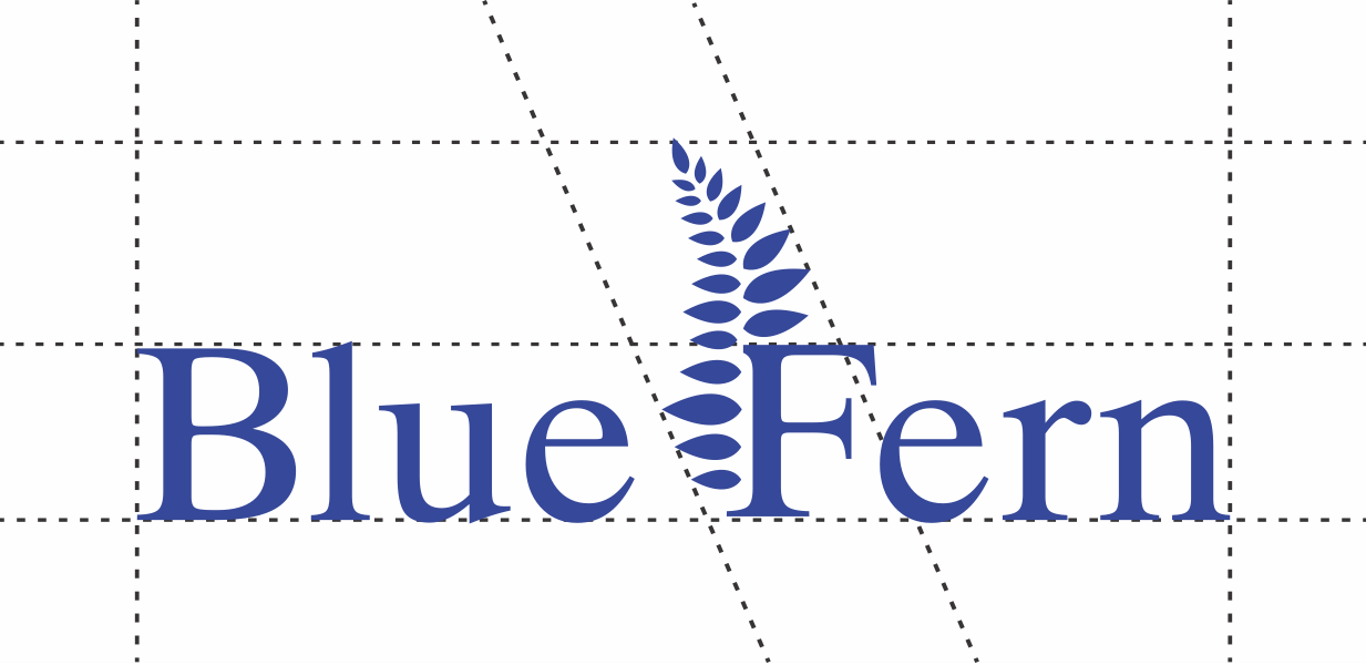
Size Ratio 3 : 8
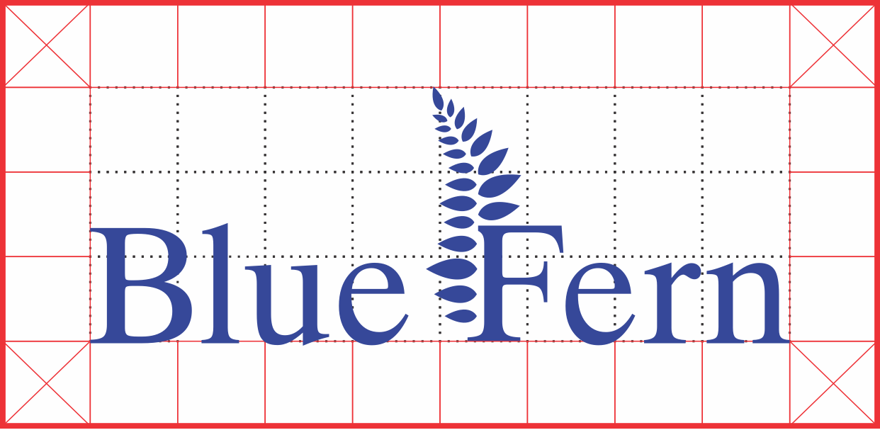
Logo should have empty space around it


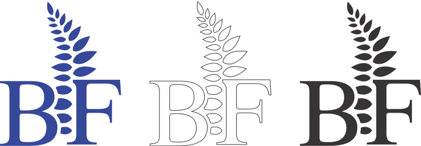
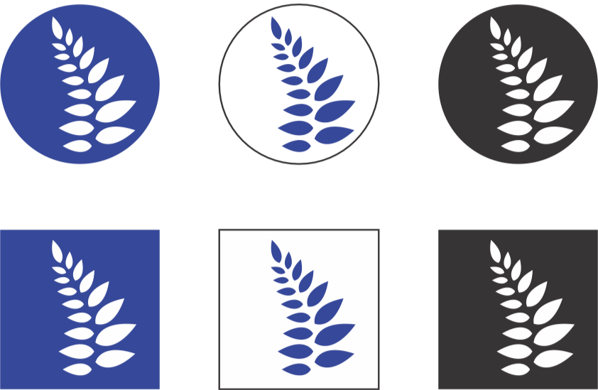
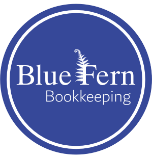
Some design applications call for unique variations of a logo. For example, letterheads may need to be printable in black and white, social media icons may require a specific logo sizing, store signage may have specific sizing constraints, and high contrast logo options may be needed for when the logo is applied to a busy or excessively dark/light background.
These logo variations allow for Blue Fern’s branding to be adapted to numerous formats and types of media. They are fully scalable for any application.

Black Silhouette
White Silhouette
Signature
Social Media Icons


Dubai is a careful balance of legibility and style. With it’s fresh, modern feel and personable character, it distances itself from blocky ‘corporate’ fonts while retaining clarity and a quality of minimalist cleanliness.
Dubai is compatible with 23 languages and is highly legible at all line weights, making it an ideal typeface for a business that needs to be able to adapt to the unique needs of local clients from diverse backgrounds.


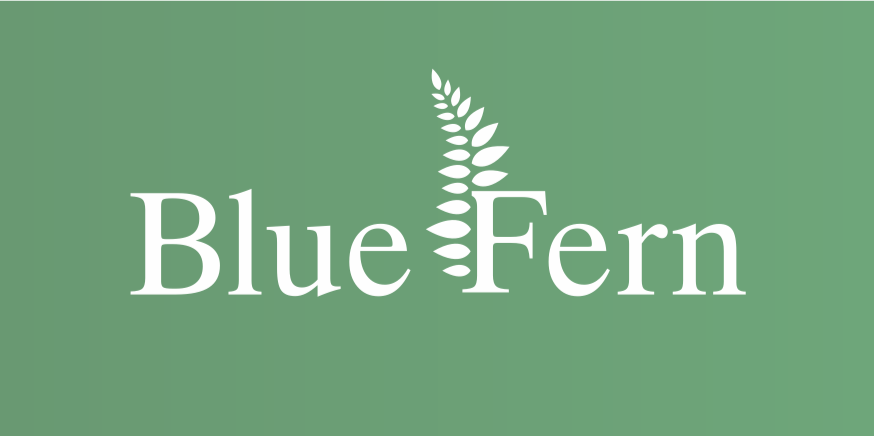
The primary Blue Fern color palette: muted greens & blues


Blue Fern’s branding is minimalist and modern. Silhouettes of various plants are a common reoccurring stylistic feature, forming a major component to Blue Fern’s visual identity. They symbolize connection, vitality, and growth, reflecting a service with fresh solutions to problems in bookkeeping, and that evolves with its clients to always adapt to their changing needs. They give a welcoming, grounded feel to the brand.
Green and blue are common financial industry colors. Green invokes imagery of money, and deeper blues are psychologically associated with security, stability, and reliability. The main palette, shown in this section’s title page, contains muted tones as per the owner’s personal taste, and to offer a less corporate feel. In all branding applications, warm and bold colors are avoided in favor of muted, cool, and/or earthy tones.

During the design process, I went through many iterations of the logo and color palettes before the branding began to come together. The biggest challenge was getting the fern design right. I initially tried to create a super high detailed fern, but none of my renders looked quite right. After more thought and consultation with the client, we concluded that intricate designs like these wouldn’t work well with small print applications like letterheads, and I went back to the drawing board. These renders lay the groundworks for the final logo design and the branding guidelines surrounding it.

What I Learned
Research and planning for the development of all components to a branding guideline
How to design letterheads that are usable for many print applications and different types of office printers
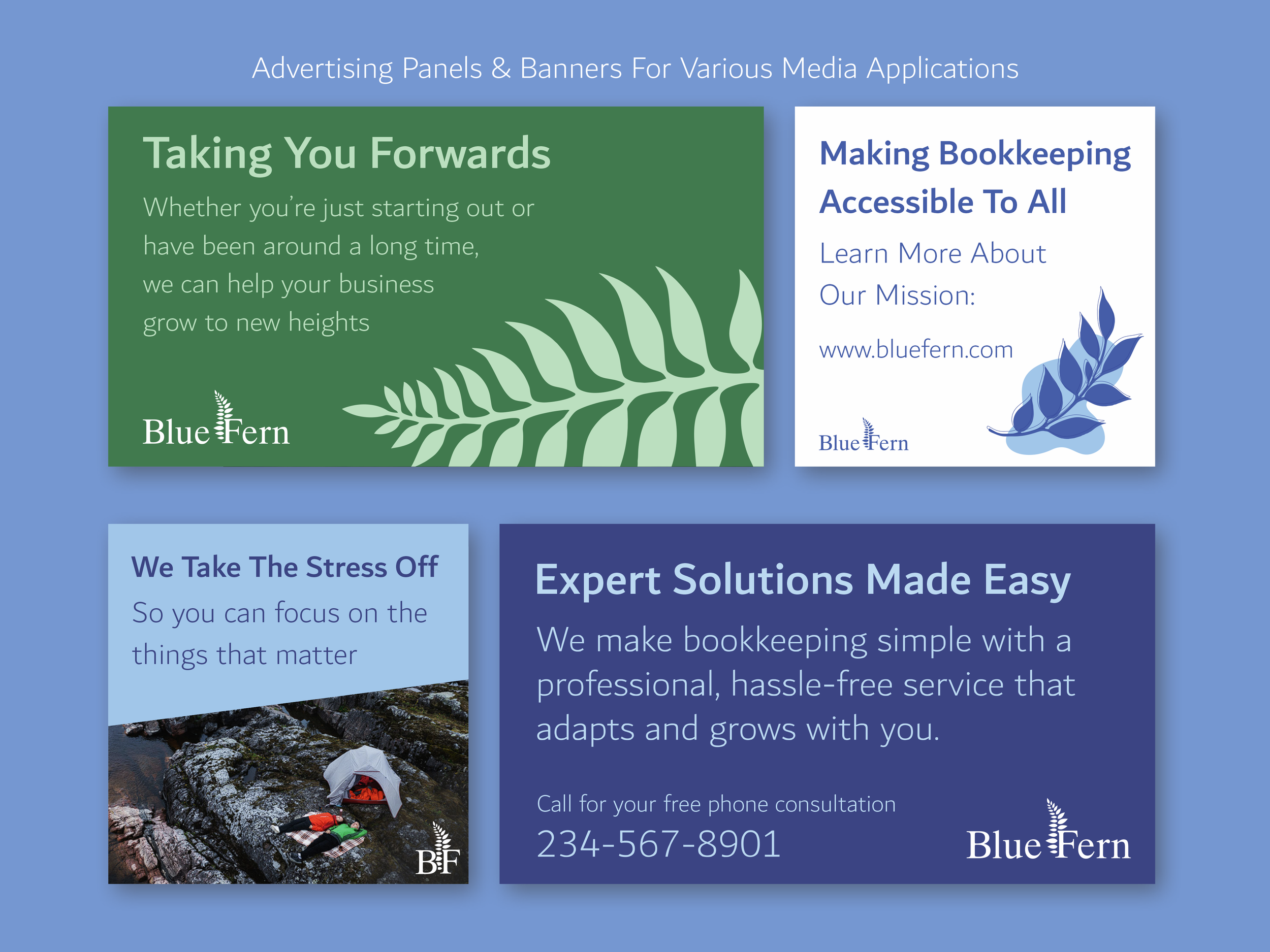
Development of advertising assets and a modular format style for a consistent branding look
Preparation of a full branding package
What I Would Do Differently
Spend more time in the branding planning process to ensure that the art direction is a seamless reflection of user and client interests
Been quicker to scrap ideas that weren’t working during ideation and prototyping. I spent a lot of time trying to refine and polish older fern designs on the logo and refine them, but I didn’t end up using these models at all