
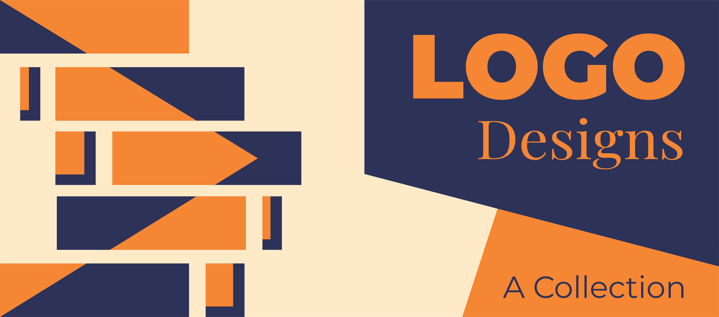


Minimalist logo designs use the fewest elements possible to encapsulate the core identity of the brand in a way that is instantly recognizable across all mediums. A good logo is compatible with many mediums, scales, formatting layouts, and color schemes, all the while still communicating what the brand is all about. Every design decision, no matter how small, is made with this compatibility in mind. Whether the logo is to be used on business cards, stickers, door decals, pylon signs, social media averts, or just letterheads, the logos I design are versatile and can be seamlessly used for any application.

Quantum Helicopters is a local business in a rural Northern community. For decades, they have provided aircraft repair and aviation services to small communities, with a primary focus on commercial sector needs like flying camp workers and specialists to remote areas. They previously didn’t have an official logo, but often used vinyl cutouts of Da Vinci’s aerial screw as identifying markers on their fleet. I integrated the form of the aerial screw into the quantum design. Bold, simple block fonts are used for easy readability and viewing at long distances, and to make it easy to paint or produce for large scale applications. Red and blues are the norm in the aviation industry. I chose a red that is attention grabbing and high contrasting, but has softer tones to it for a less corporate feel.

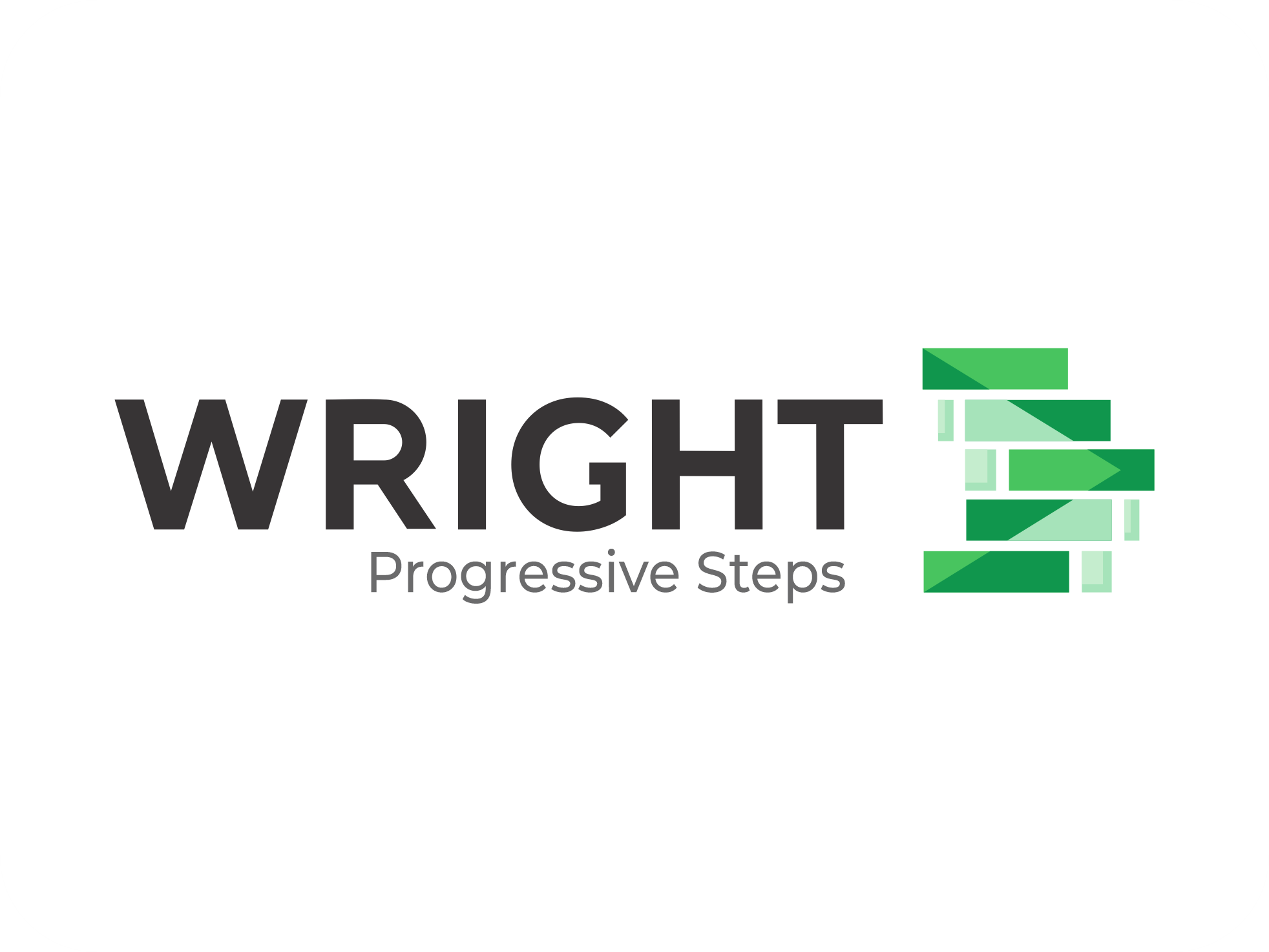
Wright Progressive Steps is a new massage therapy and wellness clinic specializing in accident and disability recovery. For their logo design, I started with a staircase design to play on the representation of client progress as a series of steps. The coloration design adds an arrow to symbolize forward movement and positive progression. Although Wright doesn’t primarily serve clients with visual impairments, many people seeking recovery experience an intersection of issues. For example, someone who was in a car accident and suffered head trauma may be seeking the service due to a skeletal misalignment caused by the crash, but may also have developed a vision impairment from the accident. Or, an elderly person seeking massage therapy may also have difficulty reading text at far distances. Thus, accessibility was a big focus of the design. large, easily readable fonts were chosen, and high contrast colors are used to ensure legibility for a variety of different conditions. These designs were also tested with color blindness simulators to ensure that the arrow would still be visible even with a deficiency.

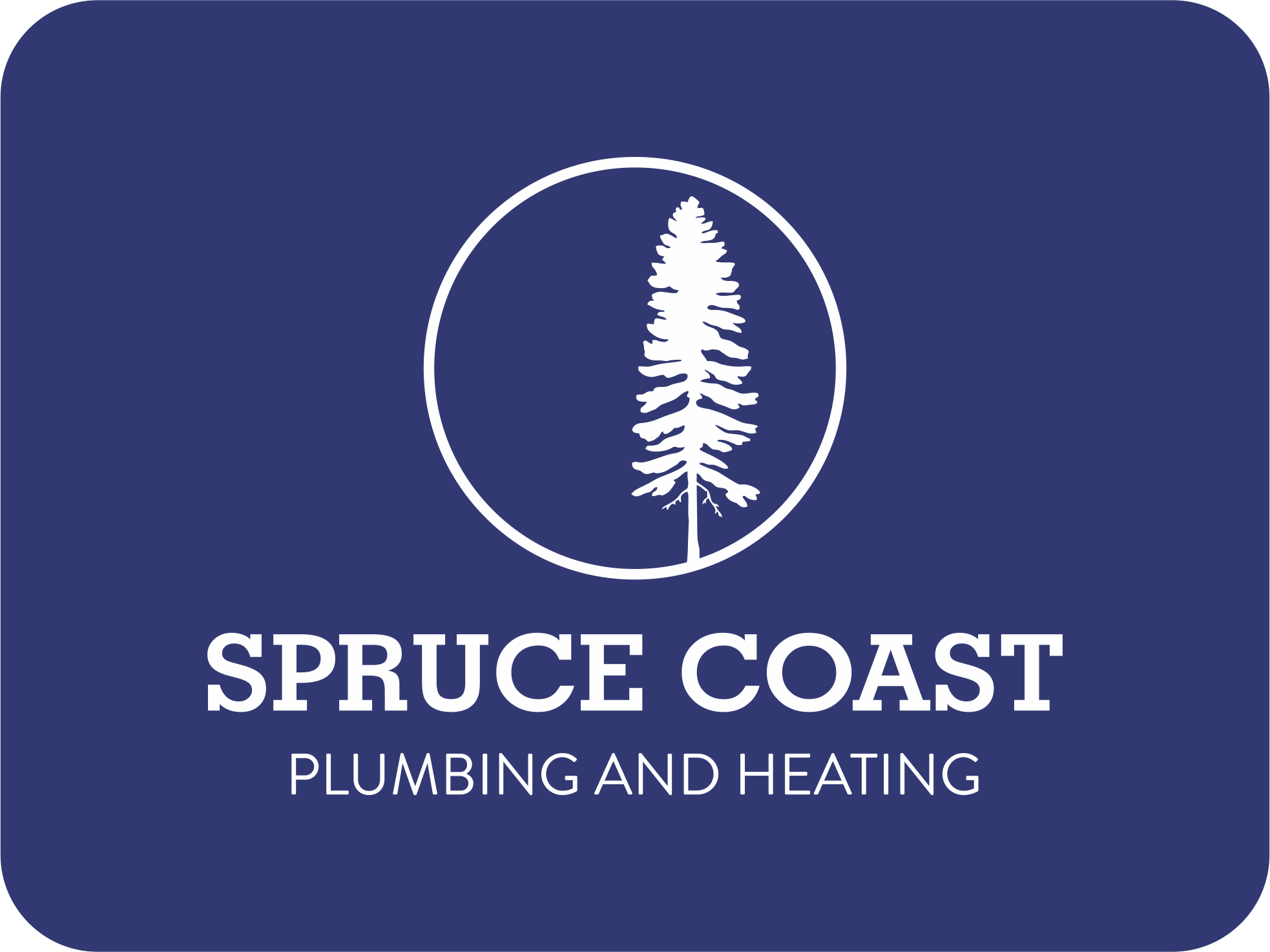
Spruce Coast Plumbing & Heating is an independent contractor offering general residential and commercial plumbing and HVAC services. I created a clean, modern logo with a minimalist feel, giving them a small brand feel and setting them apart from competitors as the “quality” option. Their logo was designed with multiple formatting options, making it easier to apply to numerous signage needs as large and small scales, such as vehicle decals, business cards, letterheads, and stickers. In a region where contractors have a reputation for being flaky, unreliable, and sometimes even dangerous in their activities, the color choice and minimalist design gives the brand a professional feel, communicating a brand that is trustworthy and takes your needs seriously.